NEST THERMOSTAT • PRODUCT • 2026
Nest Thermostat: Re-designing for Affordability and Sustainability

TIMELINE
10 Weeks
TOOLS
Figma Design
ROLES
Project Manager
Visual Design Lead
TL;DR
We redesigned Nest around a “Green & Affordable” vision — simplifying the interface and surfacing energy savings to fix the friction budget-conscious, eco-aware users felt with the app’s unnecessary complexity, better aligning the product with their values.
PROBLEM SPACE
Nest Thermostat’s
Current Experience
The current Nest experience overwhelms budget-conscious, eco-aware users with unnecessary complexity, creating friction between their values and the product, and discouraging meaningful engagement.

Existing product screens turned into lo-fidelity
Device Task Analysis Findings
Home Screen
lacks visual hierarchy, making it hard to quickly read the current temperature or energy status
Navigation
mode switching requires multiple steps with no clear affordances, leaving users unsure where to go
Scheduling
temperature blocks lack clear time context, making it hard to understand or adjust routines
Mobile App Analysis Findings
Home Screen
overloads users with data but no clear visual focus, diluting the impact of savings/mode info
Navigation
tab labels lack distinction and wayfinding, so users lose track of where they are
Scheduling
no weekly overview, forcing users to dig through nested screens and making conflicts easy to miss
SOLUTION
Re-Imagining
Nest Thermostat
Redesigned Nest around a "Green & Affordable" vision — simplifying the interface, proactively surfacing energy savings, and aligning the visual language with users' environmental values.

Visual Language
A clean, number-forward display Where the current temperature is the dominant element

Eco Mode
Real-time financial feedback that makes the cost of their energy decisions immediately visible

Savings Forward
Use simple visualizations to highlight cost and environmental benefits, reinforcing affordability and sustainability.
DESIGN PROCESS
Visual Research
& Moodboarding
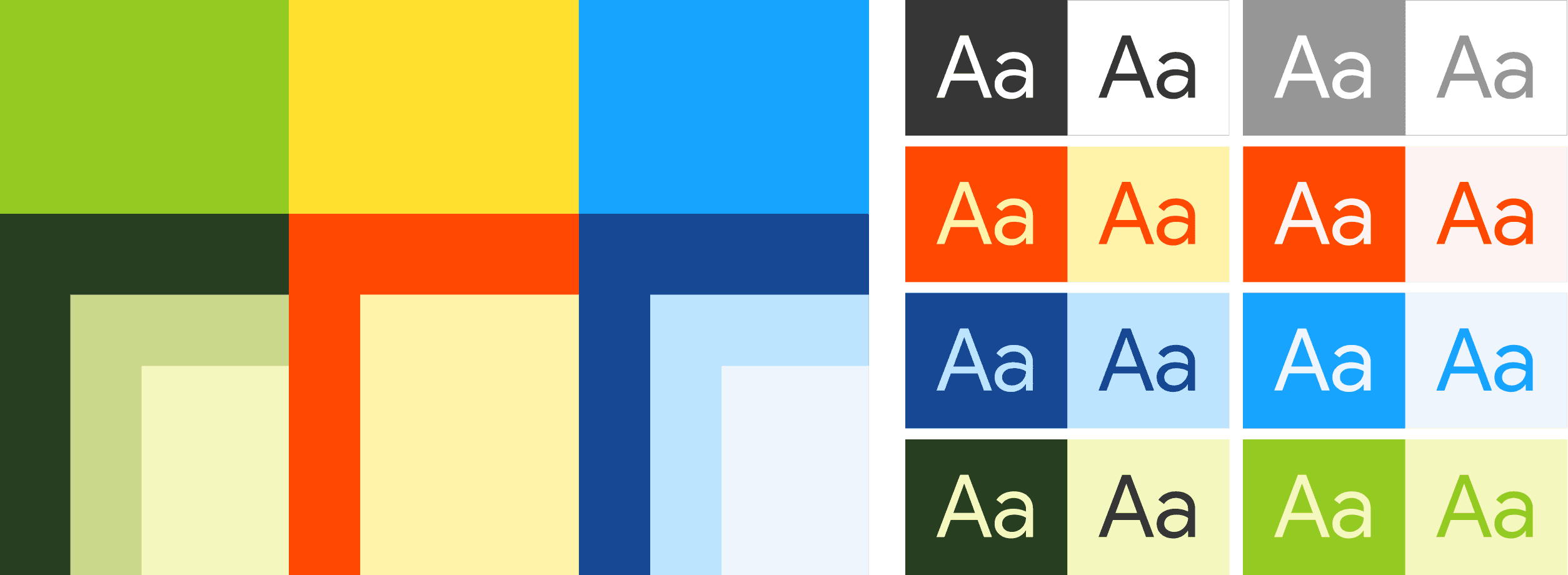
Direction was inspired by nature, stillness, and clarity — earthy greens, soft gradients, and minimal interfaces — establishing a shared visual language before any components were built.

This translated into concrete decisions:
Colour
A nature-inspired palette of greens, yellows and oranges.
Typography
A simple sans-serif system for clarity and readability.
Light Mode
Used to draw the eye to CTAs and reduce visual overwhelm.
DISCOVERY
Information Architecture
& User Flow
The team audited the existing Nest IA to identify what was necessary vs. what could be simplified, streamlining a "clunky and confusing" structure into a clearer flow — breaking down Eco Mode, Heat/Cool/Max, and scheduling so the structure felt intuitive. A key goal for the mobile app was cohesion with the hardware experience.

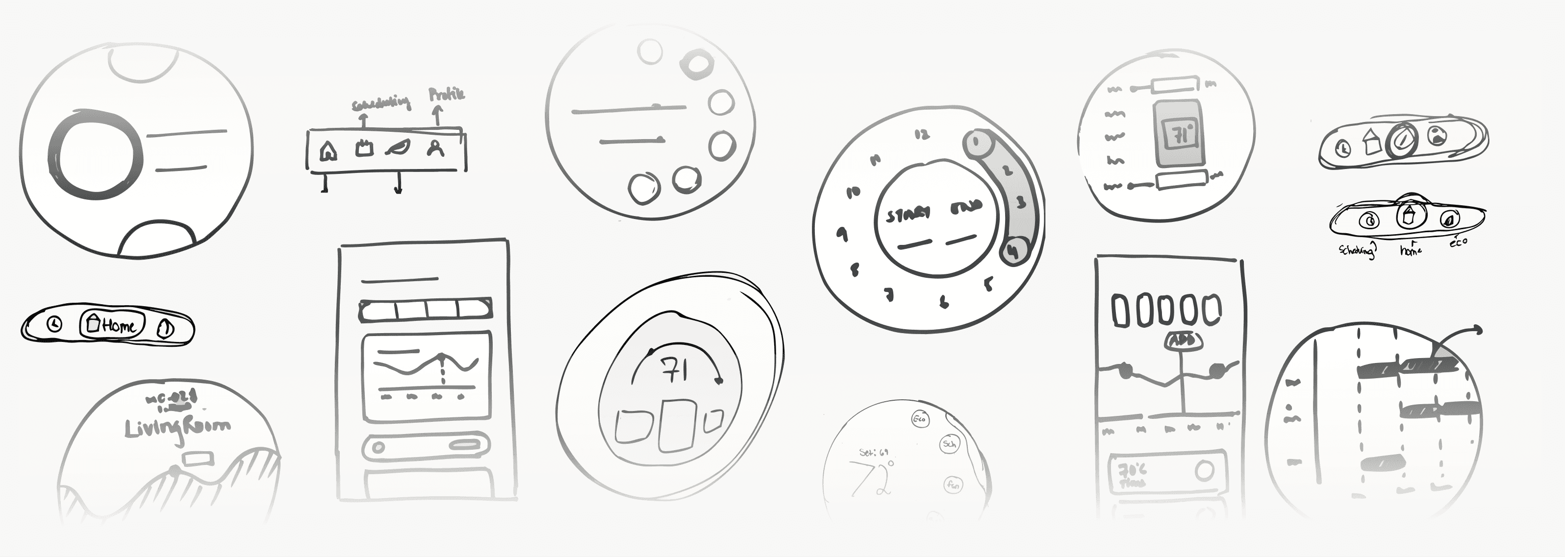
Concept Sketches
Before wireframing, each team member individually sketched ideas for the thermostat and mobile screens (home, eco mode, navigation, scheduling), then compiled and cross-picked the strongest directions. Notable decisions:
Home Screen
used graphs to help users quickly visualize savings
Navigation
matched to the thermostat’s physical rotation
Scheduling
kept intuitive with clear, detailed block scheduling

Hardware
navigation designed around a radial flow for a natural feel, with quick, clear visuals
Mobile
iterated on layout and hierarchy to make features easy to find and use

Refining the UI
After user testing the initial concepts, the team moved toward a cleaner, more minimal direction. Each mode was given its own color identity in the final rendered states:


Style Guide / Design System
A shared style library ensured visual consistency across every screen and gave developers a single source of truth.

Layout & grids
Working with a standardised layout for both types of screens seemed to benefit the consistency of the design.

Final Designs
From our A/B testing, we wrapped down to our final working model.

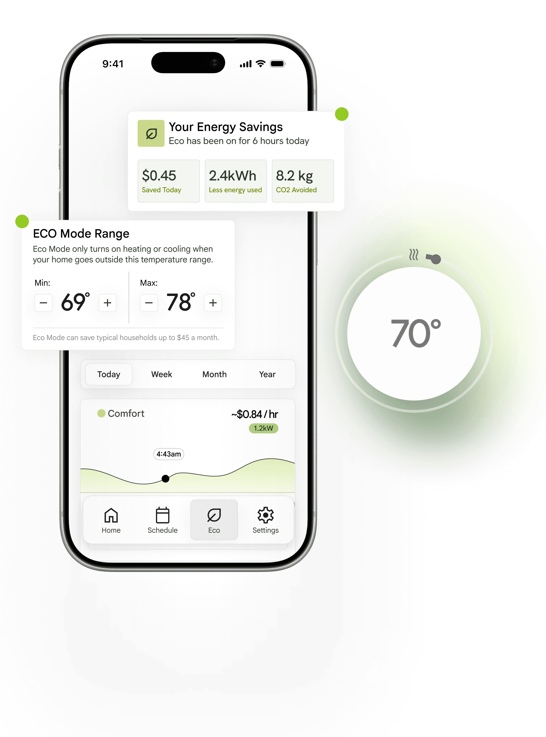
Your Energy Savings Dashboard
Real-time visibility into dollars saved, kilowatt-hours consumed, and CO₂ avoided — making every decision feel measurable and meaningful.
Energy Usage Trends
Personalized usage trends and smart suggestions help users understand their consumption patterns and adjust habits with confidence.
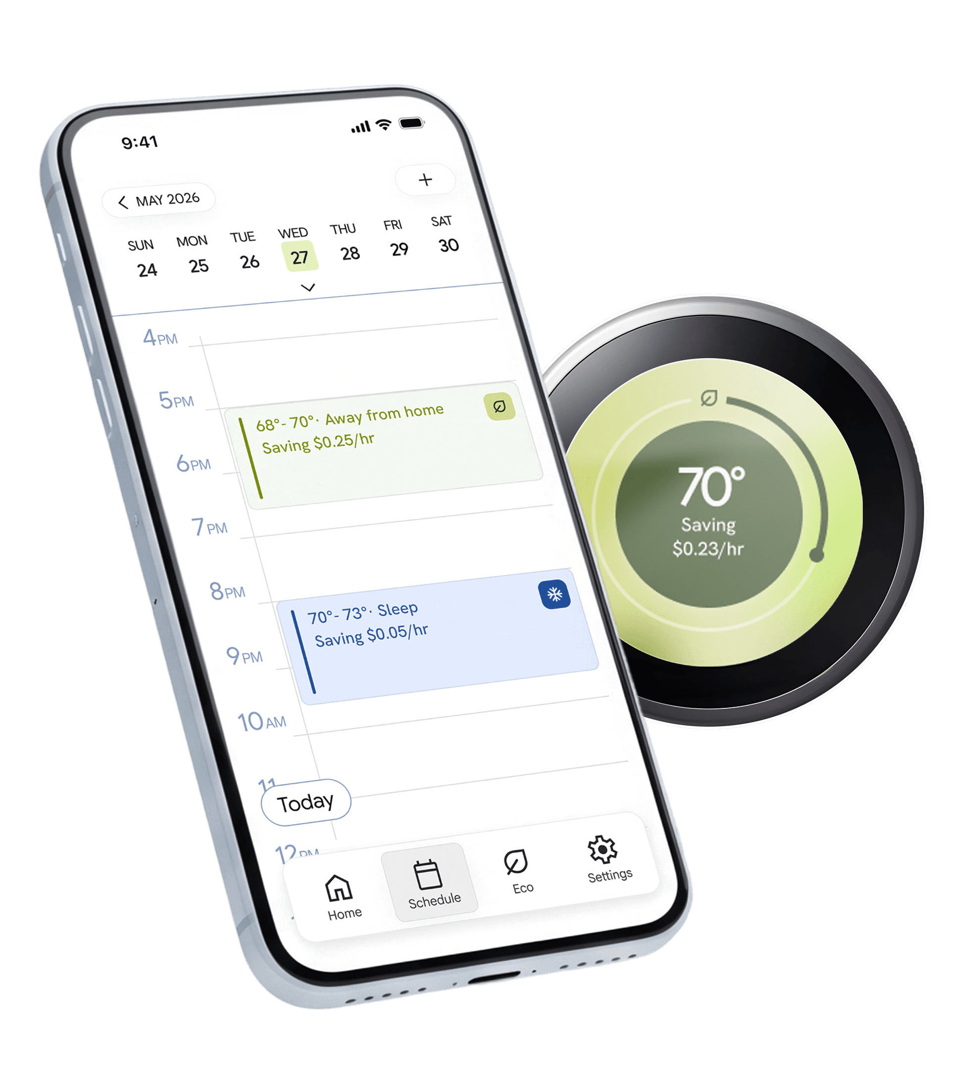
Block Scheduling
Block scheduling makes it easy to visualise your week at a glance.
Reflection
This project pushed us to think beyond screens — designing for both hardware and app as one cohesive system.

More to look at

DESIGN SPRINT · CONCEPT & GRAPHIC DESIGN
Zra Larson x Superbowl
A bold, high-energy Super Bowl halftime concept reimagining Zara Larsson’s pop universe.

CLASS PROJECT · PRODUCT DESIGN
Wally - financial literacy app
Designed a student-first finance app that helps college students track spending and build savings.
Let's get in touch!!
Mid-Fi Wireframes